


|
|
|
|
|
|
|
|
|
|
|
|
|
Digital Illustration Step-by-Step |
||||
Special thanks to Nelson Gonzalez, an old coworker who first showed me this technique, and for teaching me that Illustrator wasn't as evil as I previously thought. |
||||
 |
||||
|
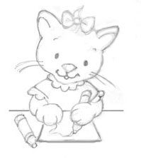
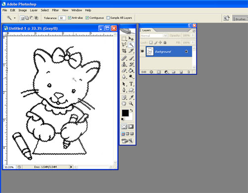
1. Even digital illustrations begin with a pencil sketch! 2. I place the artwork on a light table and trace the lines in black ink. I'm not a fantastic inker, so I do a lot of "cleanup" in Photoshop. Sometimes I make tiny changes. For instance, I'm going to create the crayon's scribble in Illustrator, so I leave that out of the inked drawing. 3. I scan the artwork at 300 dpi and import it into Photoshop. |
||||
 |
||||
| 4. Select the Magic Wand tool. Make sure the tolerance is set to 32 and Anti-Alias is checked on. Select the black line with the Magic Wand, and Select—>Similar to catch any remaining linework. Above, you can see the selected area. |
||||
 |
||||
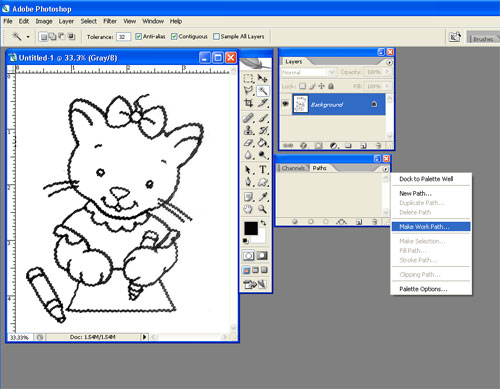
| 5. With the linework still selected, open the Paths Palette and select "Make Work Path" in the dropdown menu. | ||||
 |
||||
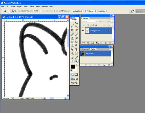
| 6. A dialog box will ask for the pixel tolerance. I usually choose 1.0 pixel tolerance. The smaller the tolerance, the truer the path will be to your original drawing. As you can see on the inside of the ear, Photoshop has drawn the work path. | ||||
 |
||||
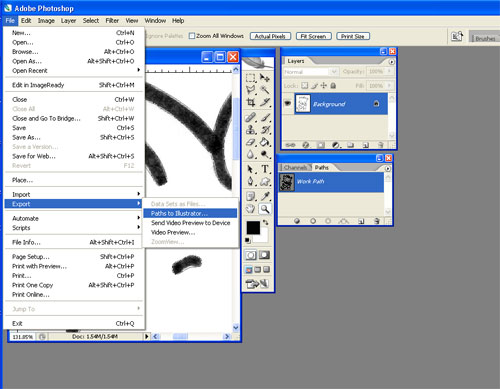
| 7. Go the File—>Export—>Paths to Illustrator. This will save your line drawing as an Illustrator file. I've named my file "kitty_lineart." | ||||
 |
||||
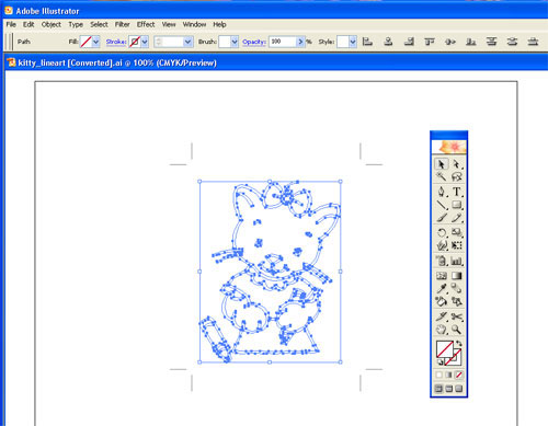
| 8. Open your lineart Illustrator file. The paths will be invisible until you Select—>All. | ||||
 |
||||
| 9. With everything still selected, make black your fill color. | ||||
 |
||||
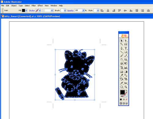
| 10. Now go through and separate the artwork by filling the interior shapes with white, leaving the exterior shapes filled with black. Basically, the white shapes will be on top of the black shapes, creating the illusion that the kitty has an outline. | ||||
 |
||||
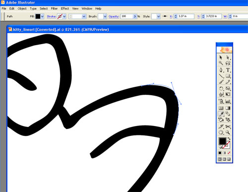
| 11. Now comes everyone's least favorite part of Illustrator -- tweaking the anchor points. I could noodle with these guys for days. To save your sanity, establish how large the finished piece will be, and view it at that size often. Otherwise, you will be wasting your time on perfecting tiny corners that no one will see! For example, this is viewed at more than 800%! | ||||
 |
||||
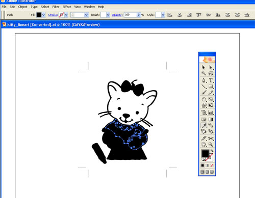
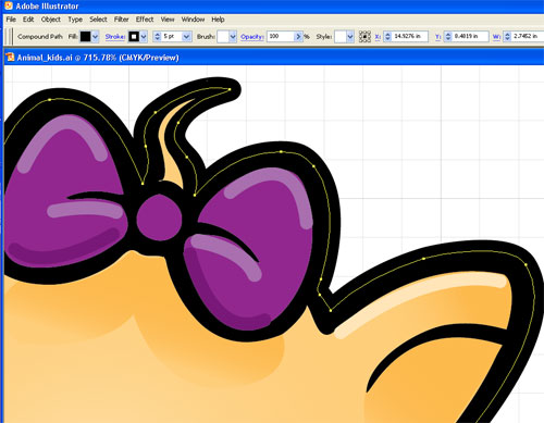
12. After adjusting and deleting extra anchor points, I really have fun with the color and gradients. The beauty of Illustrator is that if you don't like how a color looks, you can change it as many times as you want. The shadow of the bow is a gradient, as well as the inside of the ears. I also like to create “quick and dirty” highlights with the pen tool, stroking the line in white, and then playing with the transparency. Voila! Instant highlights! Above you can see how I also thicken the outside stroke of the black shape to add interest to the line weights. |
||||
 |
||||
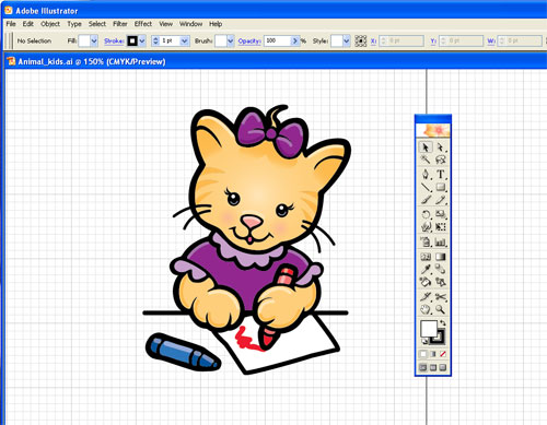
| 13. The finished piece. What a cutie! | ||||
 |
||||
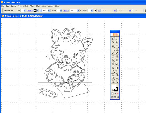
14. Here is the kitty in Outline View, so you can see the number of pieces involved. Go see the finished kitty with her classmates! |
||||
 | ||||
| © 2010
Caroline Jones McKay, all rights reserved. The artwork and illustrations contained throughout the pages of this website may not be copied or otherwise reproduced without the express written permission of Caroline Jones McKay. | ||||